Globalisation

The module explains global interdependencies, its controversial aspects and how it affects our daily lives

World maps

Have you ever thought about how the world’s population or income is distributed on earth? Which countries increasingly contribute high amounts of greenhouse gases to climate change or where the resources for our consumption come from?

Below you will see various world maps, on which the surface areas of the individual countries have been adjusted proportionally to the extent of a particular topic. What could the topic be? Assign the world maps to the matching names from the list underneath.

© Copyright Sasi Group (University of Sheffield) and Mark Newman (University of Michigan).
Correct answer: World population
The world's population is currently over 7 billion people. Of these, about 60% live in Asia. Particularly large on this map are India and China, as these countries are the most populous. The population of a country is only dependent on its size. For example, Sudan, the largest country in Africa, has a smaller population than Egypt or South Africa. According to projections, the world population will continue to grow in the coming years with 97 of every 100 new-borns being born in developing countries.
© Copyright Sasi Group (University of Sheffield) and Mark Newman (University of Michigan).
Correct answer: CO2 emissions
This map shows the proportions of carbon dioxide emissions, which are the main cause of the greenhouse effect and thus global warming. Most emissions are produced in North America, Europe, Japan and China, with the CO2 emissions in China increasing dramatically in recent years - the country now produces the most emissions globally.
© Copyright Sasi Group (University of Sheffield) and Mark Newman (University of Michigan).
Correct answer: Deforestation
Global forest cover is dwindling. This map shows the areas in which proportionately the most forest is being cut down. Most of them are in South America, especially in Brazil which, seen worldwide, has the largest forested area. There is high forest loss in Southeast Asia. In particular, the tropical rain forest in Indonesia is affected by severe deforestation. But the forest areas on the African continent are also severely depleted.
© Copyright Sasi Group (University of Sheffield) and Mark Newman (University of Michigan).
Correct answer: Deaths due to starvation
This map shows where the majority of people die every year from malnutrition. Nearly a billion people around the world suffer from hunger and malnutrition. Of these, 90% live in Africa and Asia, especially south of the Sahara and in India. In Africa, every 5th person and in Asia every10th, is affected by hunger. Malnutrition is the leading cause of infant mortality and diseases. In contrast, the amount of obesity is increasing in developed countries, which can also be taken as the cause of many diseases.
© Copyright Sasi Group (University of Sheffield) and Mark Newman (University of Michigan).
Correct answer: Wealth
This illustration shows the global wealth ratio in terms of gross domestic product (GDP), ie the value of all goods and services produced in a year in the economy of a country. Although the populations of Europe and North America account for less than 16% of the world’s population, they account for more than 50% of global GDP. In comparison, Asia generates about 30% of global GDP with over 60% of the world’s population. The countries of Africa, with a total GDP share of 2.6%, have the lowest share of global prosperity. The hidden economy, neighbourhood assistance, care for children and the elderly, and the subsistence economy, meaning all those goods and services produced for their own use, are not counted in the calculation of gross domestic product. Increasing the latter is a high priority, especially in agrarian regions in Africa, Asia and Latin America.
© Copyright Sasi Group (University of Sheffield) and Mark Newman (University of Michigan).
Correct answer: Fossil fuel use
Fuels include, for example, gas, coal, oil, nuclear energy and wood. The map shows that the consumption in the northern hemisphere is much higher - especially in North America, Europe and Japan - than in the countries of the southern hemisphere. The highest per capita consumption is found in Luxembourg, the lowest in Bangladesh.

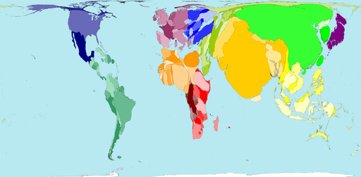
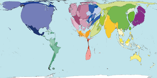
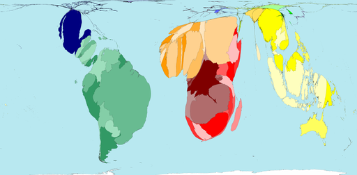
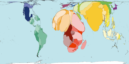
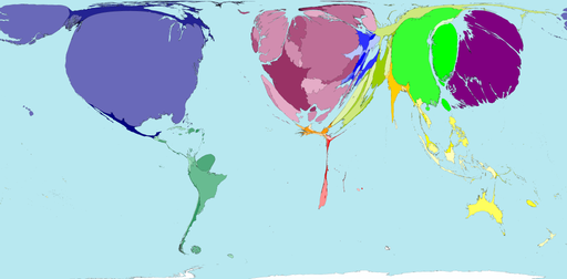
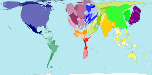
The maps have mostly been created several years ago. The numbers that were necessary for their production, however, have changed only slightly in recent years and tend towards the relationship shown or have become further exacerbated in recent years.

Sources

http://www.imf.org/external/pubs/ft/weo/2012/02/index.htm
http://www.worldmapper.org/display.php?selected=169
http://www.weltbevoelkerung.de/datenreport
http://www.worldmapper.org/display.php?selected=2
http://www.cerina.org/co2-2008
http://www.worldmapper.org/display.php?selected=119
http://www.worldmapper.org/display.php?selected=108
http://www.fao.org/docrep/016/i3027e/i3027e.pdf
http://www.worldmapper.org/display_extra.php?selected=411
http://www.worldmapper.org/display.php?selected=119